Display Color Gamuts Shoot-Out
NTSC to
Rec.2020
Dr. Raymond M. Soneira
President, DisplayMate Technologies
Corporation
Copyright © 1990-2016 by DisplayMate
Technologies Corporation. All Rights Reserved.
This article, or any part
thereof, may not be copied, reproduced, mirrored, distributed or incorporated
into any other work without
the prior written permission of DisplayMate Technologies Corporation
|
|
|

|
|
sRGB / Rec.709 Color
Gamut
Uniform 1976 CIE Color
Diagram
|
sRGB / Rec.709 Color
Gamut
Non-Uniform 1931 CIE Color Diagram
|
DCI-P3 Color Gamut
Uniform 1976 CIE Color
Diagram
|
Introduction
The Color Gamut defines the range of colors that a display can produce –
so it is the most important defining visual characteristic of any display.
While Color Gamuts have changed over the years, in the past virtually all
displays needed just a single Gamut to produce all of the content that a user
wanted to see. But with the recent development of several new larger Color
Gamut standards for producing new content, including DCI-P3 for 4K Ultra HD TVs and Digital Cinema, all future
TVs, Monitors, Smartphones, Tablets and Laptops will need to support at least
two Color Gamuts. We’ll explain how that’s done with Color Management.
So there is a big learning curve for consumers, reviewers, content
producers, and even manufacturers on the proper use of the new Color Gamuts. In this article we will examine and compare some of the
most important Display Color Gamuts that have been appearing in consumer products over the
last 60+ years, from the earliest NTSC Gamut up through the latest DCI-P3 and Rec.2020 Gamuts. The Gamuts have been evolving and getting
progressively larger...
Display Color Gamuts and Standards
Over the years there have been an incredibly wide range of Color Gamuts
that have been implemented on displays. Many are simply based on the particular
native primary colors conveniently available at the time at low cost for
different display technologies like CRT, Plasma, LCD, OLED, LED, Quantum Dots,
phosphors, lasers, etc. Many applications just need any suitable range of
colors to satisfy a user’s needs. However, essentially all imaging based
applications need a specific well defined Color Gamut in order to accurately
reproduce the colors in the image content. Over the years this has given rise
to many different standard Color Gamuts for the current image content, and they
have generally been based on what the currently existing displays at the time
could produce. So both the displays and content have evolved together over
time, and many different Color Gamuts have been defined, but they are not all
created equal...
What makes a Color Gamut important and a true Standard is the existence
of lots of content created specifically for that Gamut so manufacturers then
need to include that Standard in their products. So it is the content and
content producers that define a true Color Gamut
Standard – the displays then need to deliver
it as accurately as possible on-screen. Every display needs to adapt its native
Color Gamut for the content that it has to show. This is implemented using
Color Management, which we discuss below.
While people primarily think of Color Gamuts in terms of their outermost
saturated colors, most image content is generally found in the interior regions
of the Gamut, so it is particularly important that all of the interior less
saturated colors within the Gamut be accurately reproduced.
And if you are not sure of the set of colors that the different Gamuts
actually produce, we will show you accurately Colorized versions of the two most important Standard Gamuts being
used today so you can evaluate them visually. In case you think you have
already seen Colorized Gamuts before, the colors shown in essentially all
published Color Gamuts are fictitious and wildly incorrect. We have accurately
calculated them here.
Color Gamuts and Ambient Light
One very important
point that applies to all displays is the Color Gamut that you actually see
on-screen is reduced by any existing ambient light falling on the screen. Since
very few users watch their displays in absolute darkness (0 lux) the visible
Color Gamut that is actually seen is noticeably less than 100 percent. We
examine this very important effect and its solution in our 2014
Innovative Displays and Display Technology article.
NTSC Color Gamut
The first official Color Gamut Standard for displays was the NTSC Color Gamut, which
made its debut in 1953 for the beginning of US color television broadcasting. But the NTSC primary colors
were too saturated and couldn’t be made bright enough for use in the consumer
(CRT) TVs of that era, so the NTSC Color Gamut was Never actually used for
volume commercial production of color TVs. As a result, the NTSC Gamut was Never really an actual
Standard Color Gamut, and there is essentially no consumer content based on the
true NTSC Color Gamut. Which is amusing (and annoying) because now more than 60
years later many manufacturers and reviewers are still quoting and referring to
the NTSC Gamut as if it were some sort of state-of-the-art standard, when it
has been obsolete and colorimetrically disjoint from most other standard Gamuts
for an incredibly long time – we’ll demonstrate why below.
Manufacturers of high-tech products should be embarrassed for publishing
their specifications in terms of NTSC, an obsolete 60+ year old technology! So please everyone, let’s stop referring to the very
outdated NTSC and instead move on to the actual Color Gamuts that are being
used in today’s displays. But before we bury it, we’re going to show you what
the NTSC Color Gamut looks like in Figure 3 below together with many of the current Color Gamuts,
which we’ll cover in turn below...
The Real Analog TV and Standard Definition TV Color Gamuts
Instead of the official NTSC Gamut colors, the practical phosphor colors
that were actually used in early color TVs were developed by the Conrac
Corporation, which eventually became the SMPTE-C Color Gamut Standard. TV production studios used Conrac
color monitors to produce their broadcast TV content, so it was the Conrac Color Gamut rather
than the NTSC Gamut that was the real color television Standard Gamut. The
SMPTE-C Gamut is not that different from today’s sRGB / Rec.709 Gamut, which is
13 percent larger than SMPTE-C. Many later Gamut standards were based on SMPTE-C,
including up to Rec.601 for Digital Standard Definition TV. We are now going to
skip over lots of history and get to the Display Color Gamuts that are in use
today...
sRGB / Rec.709 Color Gamut
For over 10 years the main Color Gamut that has been used for producing
virtually all Current consumer content for digital cameras, HD TVs, the
internet, and computers, including photos, videos, and movies is a dual
standard called sRGB / Rec.709. If you want to see accurate colors for this content on
just about any consumer product, then the display needs to match the sRGB /
Rec.709 Standard Color Gamut – not larger and not smaller, because the colors
will then appear wrong and also be either too saturated or under-saturated.
There are still widely held beliefs by lots of reviewers and consumers
that viewing content on a display with a larger Color Gamut is actually better,
but it is definitely worse because the display cannot produce colors that are
not present in the original content, so the colors are just shown distorted and
over-saturated. We include the Standard sRGB /
Rec.709 Gamut in Figures 3 to 6.
Below we’ll show you both visually and quantitatively what the sRGB /
Rec.709 Color Gamut looks like in both the 1976 and 1931 CIE Diagrams.
Accurately Matching the Color Gamut Standard
For reasons similar to what occurred long ago with the NTSC Gamut, up
until recently a reasonable fraction of all displays could not produce 100
percent of the sRGB / Rec.709 Color Gamut, particularly for mobile displays,
which in many cases provided less than 70 percent of the sRGB / Rec.709 Gamut
because of similar brightness and efficiency issues that had plagued the NTSC
Gamut. As a result, their on-screen images appeared somewhat bland and
under-saturated. But today most good quality products have displays that
produce close to 100 percent of the sRGB / Rec.709 Color Gamut.
And similar issues also apply to the newest and largest Color Gamuts,
DCI-P3 and Rec.2020, which we examine in detail below. 4K UHD TVs only need to
provide 90 percent of the DCI-P3 Color Gamut Standard to receive a 4K UHD Alliance certification,
and the currently available Rec.2020 displays typically only provide 90 percent
of the Rec.2020 Color Gamut Standard. So it has always taken some time for
displays to fully and properly implement the latest Color Gamut Standards.
However, that introduces color errors that reduce the Absolute Color Accuracy of
the displayed content, which we discuss below.
Adobe RGB Color Gamut
Most high-end digital cameras have an option to use the Standard Adobe RGB Color Gamut,
which is 17 percent larger than the Standard sRGB / Rec.709 Color Gamut that is
used in consumer cameras. The Adobe RGB Gamut is also used in many other
advanced and professional imaging applications. It has a more saturated Green
Primary than the sRGB / Rec.709, which accounts for all of its larger Gamut
size. For consumers, Samsung’s Galaxy Smartphone
and Galaxy
Tablet OLED displays accurately produce the Adobe RGB Gamut as covered in
our Mobile Display Technology
Shoot-Out article series. We include the Adobe
RGB Gamut in Figure
3 below.
DCI-P3 Color Gamut
The newest Standard Color Gamut that has significant content is DCI-P3, which is 26 percent
larger than the sRGB / Rec.709 Gamut. It is being used in 4K Ultra HD TVs and
in Digital Cinema for the movie industry, so while the amount of existing
DCI-P3 content is still relatively small compared to sRGB / Rec.709, it is now
starting to grow rapidly. DCI-P3 is also being adopted in many other new
displays and applications that want to provide a larger Color Gamut with a
wider range of more saturated colors. We recently tested the new Apple iPad Pro 9.7,
which has a very accurate native 100% DCI-P3 Gamut, and it also produces a very
accurate 100% sRGB / Rec.709 Gamut by using Color Management, which we discuss
below. We include the Standard DCI-P3 Gamut in Figures 3 and 6.
Color Spectra
Displays (and everything in nature) all produce their color by
controlling and varying the amount of energy from different wavelengths of
light. The color sensations that we all see are produced entirely within the
brain from electrical signals produced by the eye from the wavelength
distributions of light it receives. The CIE Color Diagrams that we show below
relate the wavelength distributions to the colors that we see. So a good way to
compare Display Color Gamuts is by first examining their light spectra.
To see how different the DCI-P3 Color Gamut is from sRGB / Rec.709, Figure 1 below compares the
white light spectrum of an Apple iPad Pro 9.7
that has a native DCI-P3 Gamut, with an Apple iPad Air 2
that has a native sRGB / Rec.709 Gamut. Note how much narrower and more widely
spaced the DCI-P3 Primary Colors are, which results in more saturated Reds and
Greens. We include the DCI-P3 Gamut in Figures 3 and 6 below.
Figure
1. Spectrum Comparing DCI-P3 and sRGB / Rec.709 Gamuts

Rec.2020 Color Gamut
The next generation Standard Color Gamut will be the impressively large Rec.2020 standard, shown in
Figures 2 and 3
below. In fact, it is 72 percent larger than sRGB / Rec.709 and 37 percent
larger than DCI-P3. The Color Gamut is extremely wide and the Color Saturation
extremely high. However, there is almost no current existing content for
Rec.2020. And there are very few existing displays that come close to providing
Rec.2020, which requires Quantum
Dots for LCDs. Of course, continuing progress is being made in extending
the Color Gamuts for both LCD and OLED displays, so Rec.2020 will become an
important new Standard Gamut within the next several years.
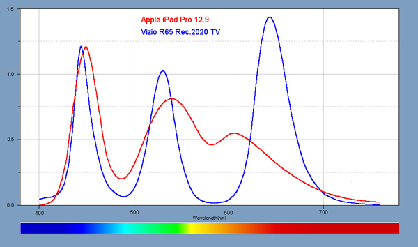
To see how incredibly challenging Rec.2020 is, Figure 2 below compares the
white light spectrum of a Vizio R65 TV (courtesy of Nanosys, which makes the Quantum Dots)
that has about 90 percent of the Rec.2020 Gamut, with an Apple iPad Pro 12.9
that has a native sRGB / Rec.709 Gamut. Note how narrow and widely spaced the
Rec.2020 Primary Colors are, and how far the Red Primary is. resulting in
significantly more saturated colors. We include the Rec.2020 Gamut in Figure 3 below.
Figure
2. Spectrum Comparing Rec.2020 and sRGB / Rec.709
Comparing the Standard Color Gamuts
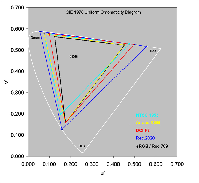
Figure 3 below shows the Color Gamuts
for most of the Standards that we have been discussing. They are all plotted on
a CIE 1976 Uniform Chromaticity (Color) Diagram that quantitatively evaluates color in a perceptually
uniform manner for human color vision with (u’,v’) color coordinates. All of
the color regions and visual differences between colors remain consistent
throughout the entire 1976 CIE Color Space, so it provides an excellent and
accurate method for specifying, manufacturing, marketing, comparing, measuring,
and calibrating displays.
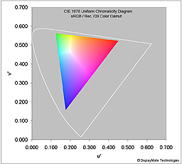
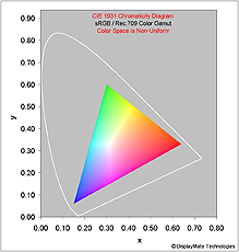
Note that the older 1931 CIE Diagrams, with (x,y) color coordinates, that are published by many
manufacturers and reviewers are very non-uniform and distorted, so they are
effectively meaningless for quantitatively evaluating Color Gamuts and their
Color Accuracy. The Color Gamuts shown in Figure
4 would appear very different in the 1931 CIE
Diagram. We’ll examine this in detail for the sRGB / Rec.709 Gamut below.
To get a better understanding for what the Color Gamuts actually produce
we’ll show you below accurately Colorized versions of the two most important
Gamuts being used today.
In all of the CIE Diagram Figures below, the outermost white curve is the limits of human
color vision – the horseshoe is the pure spectral colors and the diagonal is
the Line of Purples connecting Red and Blue at the extreme ends of human color
vision. Green is between Red and Blue in the spectrum, and is on the extreme
left in the CIE Diagrams. The Colorized Gamuts in Figures 4 to 6 below will
show this visually for one Color Gamut at a time.
A given display can only reproduce the colors that lie inside of the
triangle formed by its three Primary Colors, which are always based on Red,
Green, and Blue, following the eye’s own spectral color response. The larger
the Color Gamut the greater the range of colors that can be produced. Some
displays have more than three primary colors. In such cases the Color Gamut is
then defined by a polygon. Sharp’s Quattron for example, includes a fourth
Yellow (non-standard) primary that actually improves the display’s brightness
and efficiency more than enlarging the Gamut as seen from Figure 3.
When content is being produced, colors that are outside of the content’s
Color Gamut move automatically to the closest available color and no longer
exist and cannot be recovered later by using a larger Color Gamut. So the
highly saturated colors outside of the Color Gamut are still reproduced but
with lower color saturation.
Standard Color of White
The Standard Color of White for almost all current Color Gamut standards
is called D65,
which is the color of outdoor natural Daylight at noon with a Color Temperature close to
6500K, is marked in the Figures below as a white circle near the middle. To
deliver accurate image colors a display must match the same Color Gamut and
also the same Color of White that was used to create the content.
Unfortunately, many displays accurately reproduce the Color Gamut, but then use
an inaccurate (typically too blue) White Point, which then introduces color
accuracy errors throughout the entire inner regions of the Color Gamut.
Color Gamut Size Comparisons in Terms of Area
A common metric for comparing the relative sizes of the Color Gamuts is
by using their relative areas within the Uniform 1976 CIE Diagram. The relative
Gamut sizes that are calculated from the non-uniform 1931 CIE Diagram are
significantly different and are compared in a later section below.
The Adobe RGB Color Gamut is 17 percent larger than sRGB / Rec.709.
The DCI-P3 Color Gamut is 26 percent larger than sRGB / Rec.709.
The Rec.2020 Color Gamut is 72 percent larger than sRGB / Rec.709 and
37 percent larger than DCI-P3.
And for those of you still interested in NTSC Gamut statistics:
The NTSC
Color Gamut is 98 percent of the Adobe RGB Color Gamut. So while they are both very close in Gamut
area and size, note how very different their triangular Gamut shapes and color
regions are in Figure 3, proving that the still
current practice of using NTSC for Gamut specifications and comparisons has
little colorimetric meaning or useful quantitative value for the current Gamuts
and displays (and doubly wrong when combined with the non-uniform 1931 CIE
Color Space).
Color Gamut Comparisons in Terms of Just Noticeable
Color Differences JNCD
A better metric for evaluating the new larger Color Gamuts is by how
different their Primary Colors are in terms of visual Just Noticeable Color Differences JNCD from the Standard sRGB
/ Rec.709 Primary Colors, calculated using the Uniform 1976 CIE Diagram, where
visual color differences are proportional to the linear distances between any
two colors in the Diagram. Figure 4 shows the distances corresponding to 1 JNCD
and 3 JNCD, with 1 JNCD = 0.0040 in the (u’,v’) 1976 Uniform Color Space. The
1931 CIE Color Space cannot be used for JNCD because it is Non-Uniform.
For Adobe RGB the Green Primary is 12.8 JNCD from sRGB / Rec.709.
For DCI-P3 the Red Primary is 11.4 JNCD and the Green Primary is 7.6 JNCD from
sRGB / Rec.709.
For Rec.2020 the Red Primary is 26.5 JNCD, the Green Primary is 18.4
JNCD, and the Blue Primary is 9.0 JNCD from sRGB / Rec.709.
So the Visual Color Differences between the Color Gamuts are quite
large, very noticeable, and significant.
Figure
3. Standard Color Gamuts Plotted on a CIE 1976 Uniform Chromaticity Diagram
Next we’ll examine accurately Colorized versions of the sRGB / Rec.709
and DCI-P3 Color Gamuts to visually examine and quantitatively compare their
Color Spaces.
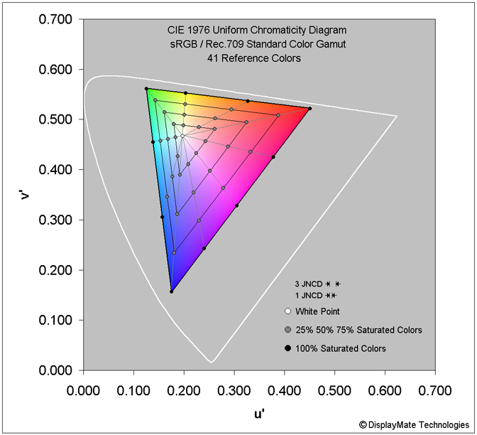
Accurately Colorized sRGB / Rec.709 Color Gamut
Figures 4 and 5 below show an accurately
Colorized sRGB / Rec.709 Color Gamut. For displays this can only be done for a single Color
Gamut at a time. The colors in the Figure have been accurately calculated to
show the real colors within the sRGB / Rec.709 Gamut – the colors shown in most
published Color Gamuts are fictitious and wildly incorrect. Also included are
41 Reference Colors that we use for measuring the Absolute Color Accuracy
throughout the entire Gamut, which is discussed below.
Note that printed versions of the Colorized Gamuts depend on the
particular inks being used and also their spectral absorption of the particular
ambient light you are viewing them in, so they cannot be as accurate as an
emissive display, and they also generally provide smaller Gamuts than most
displays.
In order to see the actual accurate colors in the Colorized Gamut, your
display must be set to the sRGB / Rec.709 Standard (that is found on most
recent Smartphones, Tablets, Laptops, Monitors, and Full HD TVs for example) or
support active Color Management. Otherwise, the colors will be incorrect, and
much too saturated if you are watching on a DCI-P3 UHD TV or display as
discussed below.
Note that every color
within the Gamut is shown at its maximum Brightness (Luminance). White is the
brightest color near the middle because it is the sum of the Peak Red, Green,
and Blue Primary Colors. The Secondary Colors of Cyan, Magenta, and Yellow
radiate from the White Point as ridges because they are the sums of two Primary
Colors.
One particularly interesting result seen in
Figure 4 is how
relatively small the Green region of the sRGB / Rec.709 Color Gamut is in the
accurate 1976 CIE Uniform Color Space, accounting for just 10 percent of the
total Gamut. However, the Green region is rendered 2.4 times larger in the
distorted and Non-Uniform 1931 CIE Chromaticity Diagram, as shown in Figure 5 below. The newer
Color Gamuts: Adobe RGB, DCI-P3, and Rec.2020 all significantly enlarge the
Green region of their Color Space within the Uniform 1976 CIE Diagram.
Figure
4. Accurately Colorized sRGB / Rec.709 Color Gamut with Reference Colors
Absolute Color Accuracy and Just Noticeable Color
Differences JNCD
One very important issue is the accuracy of each display’s Color Gamuts,
and the Absolute Color Accuracy for all of the colors within the entire Color Gamut. One
very important reason for accurately Colorizing and rendering each Color Gamut
in the 1976 CIE Uniform Color Space is that the display’s Color Accuracy and
Color Calibration can be accurately analyzed uniformly, and then the true Color Errors uniformly
minimized for all of the colors within the Color Gamut. The errors are
expressed in terms of Just Noticeable Color Differences JNCD, which correspond to fixed linear distances within the
CIE Diagram. Figure 4 shows the distances corresponding to 1 JNCD and 3 JNCD,
with 1 JNCD = 0.0040 in the (u’,v’) 1976 CIE Color Space.
For each tested display we measure the Absolute Color Accuracy of 41
Reference Colors, which are shown for sRGB / Rec.709 in Figure 4. For a good
example, see this color accuracy analysis for both the DCI-P3 and sRGB /
Rec.709 Color Gamuts in the Apple
iPad Pro 9.7, which includes a more detailed discussion of JNCD.
In our Display
Absolute Color Accuracy Shoot-Out article we show the colors for a wide
range of facial skin tones and fruits and vegetables so that you can get a good
idea of where these important colors fall within the 1976 CIE Diagram.
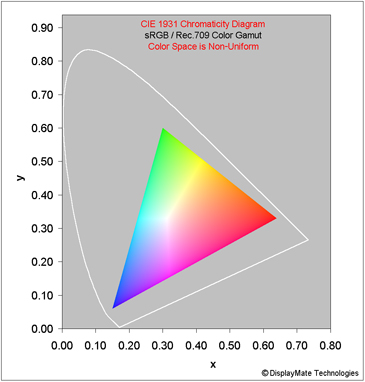
Accurately Colorized 1931 CIE Diagram for the sRGB / Rec.709
Color Gamut
The best way to demonstrate the large differences between the 1976
Uniform and the older 1931 Non-Uniform CIE Diagrams is to show an accurate
Colorized sRGB / Rec.709 Color Gamut for both of them side-by-side in Figure 5. Note that for the
comparison both of the Color Triangles have been scaled to have the same
geometric area in the Figures.
Note how differently the colors are distributed within each Color Space. The obsolete but still widely used 1931 CIE Diagram has a
very non-uniform Color Space that significantly expands the Green region (by a
large factor of 2.4 in area) and significantly compresses the Blue Region (by a
large factor of 1.7 in area), providing a very distorted representation of
human color perception. The Red regions are only 7 percent different in area,
but note how different their shapes are.
Specifying and analyzing displays in terms of the very non-uniform and
very distorted 1931 CIE Color Space introduces significant performance,
calibration and color accuracy errors. Many manufacturers also specify their
guaranteed display color accuracy in terms of the non-uniform (x,y) 1931 CIE
coordinates, which results in large variations and differences in color accuracy
throughout the Color Space.
The 1976 CIE Diagram transforms and corrects the distortions in the
original 1931 version to produce a Uniform Color Space that accurately renders
human color perception and color accuracy. It's
about time that manufacturers and reviewers abandon the obsolete 1931 CIE Color
Space for all of the above reasons!
Figure
5. Accurately Colorized Comparisons of the 1976 and 1931 CIE Color Spaces
|

|
|
|
1976 CIE Uniform
Diagram for sRGB / Rec.709
|
1931 CIE Non-Uniform
Diagram for sRGB /
Rec.709
|
|
For the
comparison both Color Triangles have been scaled to have the same geometric
area in the Figures.
|
Inaccurate Color Gamut Comparisons in terms of the 1931 CIE
Diagram:
Note that the relative differences between the Color Gamuts that we show
above are based on the 1976 CIE Uniform Chromaticity Diagram. Some
manufacturers and reviewers still specify their Color Gamuts by using the
highly non-uniform 1931 CIE Diagram that greatly exaggerates and stretches the
relative differences between the Color Gamuts, so those comparisons are very
inaccurate and essentially meaningless.
The Color Gamut size comparisons that are calculated and specified by
many manufacturers using the 1931 CIE Diagram are also very inaccurate and very
misleading. For example, in the non-uniform 1931 CIE Color Space the Adobe RGB Color Gamut is 35
percent larger than sRGB / Rec.709, more than double the accurate 17 percent
value listed above from the 1976 CIE Uniform Color Space. And in the 1931 CIE
Color Space the DCI-P3 Color Gamut is 36 percent larger than sRGB / Rec.709, a 38
percent size exaggeration compared to the accurate 1976 CIE value of 26 percent
larger.
These large discrepancies prove that using the 1931 CIE Color Space for
specifications and comparisons has little colorimetric meaning or useful
quantitative value for current displays. Manufacturers should be embarrassed
for specifying their products in terms of the obsolete and very misleading
non-uniform 1931 Color Space!
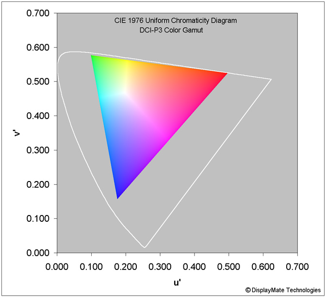
Accurately Colorized DCI-P3 Color Gamut
Figure 6 below shows an accurately Colorized DCI-P3 Color Gamut.
For displays this can only be done for a single Color Gamut at a time. The
colors in the Figure have been accurately calculated to show the real colors
within the DCI-P3 Gamut – the colors shown in most published Color Gamuts are
fictitious and wildly incorrect.
In order to see the actual accurate colors in the Colorized Gamut, your
display must be set to the DCI-P3 Standard (on a 4K UHD TV or Apple iPad Pro 9.7
for example) or support active Color Management. Otherwise the colors that you
see will be incorrect. They will all appear significantly under-saturated if
you are watching on a sRGB / Rec.709 display as discussed above.
Note that every color
within the Gamut is shown at its maximum Brightness (Luminance). White is the
brightest color near the middle because it is the sum of the Peak Red, Green,
and Blue Primary Colors. The Secondary Colors of Cyan, Magenta, and Yellow
radiate from the White Point as ridges because they are the sums of two Primary
Colors.
Figure
6. Accurately Colorized DCI-P3 Color Gamut
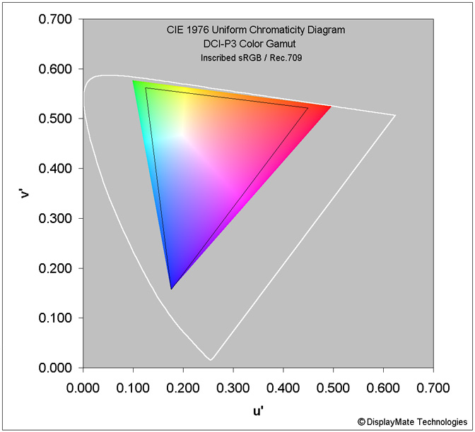
Differences Between the DCI-P3 and sRGB / Rec.709 Gamuts
Figure 7 below shows an accurately Colorized DCI-P3 Color Gamut
with an inscribed sRGB / Rec.709 Gamut in order to show the differences between
the two Gamuts.
If your display is set to DCI-P3 then the colors both inside and outside
of the sRGB / Rec.709 triangle will be accurate, so you can see what the new
set of more saturated colors in the DCI-P3 Gamut provide. If your display is
set to sRGB / Rec.709 then the colors will all appear as less saturated sRGB /
Rec.709 Gamut colors, however, you will still get an idea of how much larger
the DCI-P3 Color Gamut actually is.
Important New Saturated Green and Red Color Regions
Note how much larger the Green region in the DCI-P3 color space is in
comparison to sRGB / Rec.709, by 52 percent. The extreme Reds have also been
significantly expanded. Based on the measurements in our Absolute Color
Accuracy Shoot-Out, most fruits and vegetables are found in the most
saturated Red to Orange to Yellow to Green regions of the Color Space (so they
visually attract animal attention for eating and spreading their seeds), and
the most highly saturated colors are also heavily utilized in lots of human
generated content in order to get people’s visual attention, so the enlarged
Red to Green sliver in the DCI-P3 Color Space is actually very important.
Figure
7. Comparing the sRGB / Rec.709 and DCI-P3 Color Gamuts
An Accurately Colorized Rec.2020 Color Gamut
It
is still premature for us to generate an accurate Colorized Rec.2020 Color
Gamut at this
time because there are currently very few displays that come close to providing
Rec.2020, and there is almost no current existing content for Rec.2020. As a
result, a Colorized Rec.2020 Color Gamut would appear just like the smaller
native Color Gamut of your current display. And printed inks are also unable to
reproduce the highly saturated Rec.2020 colors.
When
things advance a bit further, we’ll revisit the entire topic of Display Color Gamuts...
Color Management for Multiple Color Gamuts
When a display needs to support one or more additional Color Gamuts like
sRGB / Rec.709 that are smaller than its native Color Gamut, that can be accomplished with
digital Color Management performed by the firmware, CPU or GPU for the display.
The digital R,G,B values for each pixel in an image being displayed are first
mathematically transformed so they colorimetrically move to the appropriate
lower saturation colors closer to the White Point. The available Color Gamuts
can either be selected manually by the user, or automatically switched if the
content being displayed has an internal Tag that specifies its native Color
Gamut, and that Tag is recognized by the display’s Operating System or
firmware. The Apple iPad
Pro 9.7 implements Color Management that automatically switches between the
DCI-P3 and sRGB / Rec.709 Gamuts.
Another more advanced color management approach is for the content to
include meta-data with detailed specifications for the colorimetry of the
content, and then it is up to the display to implement it as accurately as
possible using its native Color Gamut colorimetry and photometry.
Summary and Conclusion
Our overview of Color Gamuts from the earliest NTSC Gamut to the latest
DCI-P3 and Rec.2020 Gamuts has demonstrated the importance of eliminating the
widespread use of the obsolete 1953 NTSC Gamut and the obsolete 1931 CIE
Diagram in the display industry. Switching to current display technology
standards is now tremendously overdue.
The 1953 NTSC Gamut was never actually used for production displays, and
is colorimetrically different from current standard Gamuts, so it is misleading
to use as a Reference Gamut. The 1976 CIE Diagram transforms and corrects the
large distortions in the original 1931 Diagram to produce a uniform color space
that accurately renders human color perception and color accuracy.
Switching to current colorimetry standards is not only essential for
properly specifying, measuring, manufacturing and accurately calibrating
displays, but also for comparing and marketing them to both product
manufacturers and consumers.
About the Author
Dr.
Raymond Soneira is President of DisplayMate Technologies Corporation of Amherst,
New Hampshire, which produces display calibration, evaluation, and diagnostic
products for consumers, technicians, and manufacturers. See www.displaymate.com. He is a research
scientist with a career that spans physics, computer science, and television
system design. Dr. Soneira obtained his Ph.D. in Theoretical Physics from
Princeton University, spent 5 years as a Long-Term Member of the world famous
Institute for Advanced Study in Princeton, another 5 years as a Principal
Investigator in the Computer Systems Research Laboratory at AT&T Bell
Laboratories, and has also designed, tested, and installed color television
broadcast equipment for the CBS Television Network Engineering and Development
Department. He has authored over 35 research articles in scientific journals in
physics and computer science, including Scientific American. If you have any
comments or questions about the article, you can contact him at dtso.info@displaymate.com.
DisplayMate Display Optimization Technology
All Tablet
and Smartphone displays can be significantly improved using DisplayMate’s
proprietary very advanced scientific analysis and mathematical display modeling
and optimization of the display hardware, factory calibration, and driver
parameters. We help manufacturers with expert display procurement, prototype
development, testing displays to meet contract specifications, and production
quality control so that they don’t make mistakes similar to those that are
exposed in our public Display Technology Shoot-Out series for consumers. This
article is a lite version of our advanced scientific analysis – before the
benefits of our DisplayMate
Display Optimization Technology, which can correct or improve all of these
issues. If you are a display or product manufacturer and want to significantly
improve display performance for a competitive advantage then Contact DisplayMate Technologies.
About DisplayMate Technologies
DisplayMate Technologies specializes in proprietary advanced
scientific display calibration and mathematical display optimization to deliver
unsurpassed objective performance, picture quality and accuracy for all types
of displays including video and computer monitors, projectors, HDTVs, mobile
displays such as Tablets and Smartphones, and all display technologies including
LCD, LCD, 3D, LED, LCoS, Plasma, DLP and CRT. This article is a lite version of our intensive
scientific analysis of Tablet and Smartphone mobile displays – before the
benefits of our advanced mathematical DisplayMate Display Optimization
Technology, which can correct or improve many of the display deficiencies. We offer DisplayMate display
calibration software for consumers and advanced DisplayMate display diagnostic
and calibration software for technicians and test labs.
For
manufacturers we offer Consulting Services that include advanced Lab testing
and evaluations, confidential Shoot-Outs with competing products, calibration
and optimization for displays, cameras and their User Interface, plus on-site
and factory visits. We help manufacturers with expert display procurement,
prototype development, and production quality control so they don’t make
mistakes similar to those that are exposed in our Display Technology Shoot-Out
series. See our world renown Display
Technology Shoot-Out public article series for an introduction and preview.
DisplayMate’s
advanced scientific optimizations can make lower cost panels look as good or
better than more expensive higher performance displays. If you are a display or
product manufacturer and want to turn your display into a spectacular one to
surpass your competition then Contact
DisplayMate Technologies to learn more.
Article Links: TV
Display Technology Shoot-Out Article Series Overview and Home Page
Copyright © 1990-2016 by DisplayMate
Technologies Corporation. All Rights Reserved.
This article, or any part
thereof, may not be copied, reproduced, mirrored, distributed or incorporated
into any other work without
the prior written permission of DisplayMate Technologies Corporation