|
|
|
|
|
|
The Gamma for the Sony CRT agrees perfectly with the 2.20 standard value. (CRT monitors from Ikegami, another major brand of professional studio monitors, also have a Gamma of 2.20 according to their Director of Engineering.) The LCD has a Gamma greater than the standard, the DLP is less and the Plasma much less than the 2.20 standard. (Note: the Plasma and DLP displays both provide a choice among several Gamma selections. They are identified only by their menu entry selection numbers, not by their Gamma values. We chose the steepest available for each, which provides the closest agreement with the 2.20 standard.) The real question is how much of a difference do these different gray-scales and values of Gamma make and how do they affect the appearance of an image.
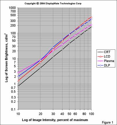
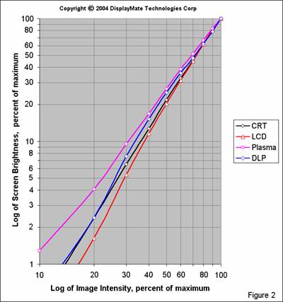
How Gamma Affects the Image Gamma has a major effect on image brightness, contrast, hue and color saturation. In order to explore this we’ll examine the differences between the LCD, which has the highest Gamma, and the Plasma, which has the lowest. To see this on the graph in Figure 2, compare the relative brightness between the LCD and Plasma at 50% signal intensity and at 25% signal intensity. At 50% intensity the Plasma has a relative brightness that is 1.3 times that of the LCD. At 25% intensity the Plasma has a relative brightness that is 2.1 times that of the LCD.
Image Contrast The higher the Gamma the faster the brightness decreases with signal intensity level. Consider a black and white photograph. The brightness ratio of the bright content to the dark content will be considerably greater on the LCD than on the Plasma. These ratios of brightness are actually just contrast ratios. For example, considering the 25% intensity level, the LCD will have a contrast that is 2.1 times greater than the Plasma. Overall the image on the LCD will appear to have a higher contrast than a standard 2.20 Gamma display and the Plasma will have a lower contrast. Note that this is independent of the Contrast control setting (because it actually affects display brightness and not contrast, see Part I and below) and also independent of the (checkerboard) Display Contrast ratio measured in Part I (as long as the ratio doesn’t fall too low). So Gamma turns out to be the determining factor in visual contrast for images on a display. A control that varies Gamma will function as a true contrast control.
Image Brightness Again, the higher the Gamma the faster the brightness decreases with signal intensity. Since most images have a wide range of intensities, displays with a higher Gamma will appear darker and those with a lower Gamma will appear brighter. Given the industry’s emphasis on brightness, it’s not surprising to find a bias towards lower Gamma values.
Hue When combining the primary colors to produce color mixtures in an image, different Gammas result in different brightness values for the primaries, which produces varying hues and brightness in the resulting colors. For example, when mixing red and green in the ratio of 2 parts red to one part green (100% red intensity and 50% green intensity), which produces a brown, the green will be 1.3 times brighter on the Plasma than on the LCD, so the browns will be different. We verified this visually: the brown was noticeably redder on the LCD than on the Plasma, as expected from their Gammas. From this we see that image hues are significantly affected by Gamma. Gamma will also have a similar effect on flesh tones. While the display’s Tint control can be used to correct the flesh tones to their proper visual appearance, all of the other colors will be modified at the same time, introducing additional errors in hue throughout the image, so a standard Gamma is necessary in order to get accurate color. Most people will tweak the Tint and other controls in order to make the faces come out right. But every tweak that’s used to compensate for a display parameter error leads to a progression of inaccuracies that add up.
Color Saturation Color Saturation is also affected by Gamma in the same way as hue, except that all three primary colors are involved. The primary color with the lowest signal intensity in any color mixture determines the Saturation of the resulting color because it is perceived as combining with equal intensities of the two other primaries to produce a low intensity shade of white (dark gray). This washes out the appearance of the color mixture into a lower saturation pastel. Since Gamma has the greatest effect on the dimmest primary color the brightness of this white (gray) component varies significantly. For example, 75% red, 50% green and 25% blue is perceived as a red-green mixture having a 25% white (gray) component. This white component will be 2.1 times brighter on the Plasma than on the LCD, so the color will have a much lower saturation on the Plasma than on the LCD. As a result color Saturation is significantly affected by Gamma. Higher Gammas increase color saturation and lower Gammas decrease color saturation. The display’s color Saturation control can be used to reduce the saturation error resulting from a non-standard Gamma, but it can’t eliminate it because the saturation error varies with signal intensity. Again, people will tweak the Saturation Control to make the faces come out right, but all of the other colors will be modified at the same time. For a Gamma that’s too low the Saturation Control will need to be turned up and as a result many colors may wind up appearing too saturated. So a standard Gamma is necessary in order to get accurate color saturation at all intensities. Note that a Gamma higher than the standard 2.20 can be used with flat panel displays to counteract the reduced color saturation that’s due to an elevated black-level luminance (because the glow washes out the colors), so it is possible to manipulate this effect into a corrective action.
Variations in Gamma In principle, the gray-scales should appear as perfectly straight lines (power-laws) in Figures 1 and 2. Otherwise the Gamma for a display will vary with signal intensity, and then so will all of the characteristics discussed above, including contrast, hue and saturation. In the brown example above, a display will produce different browns at different signal intensities if the gray-scale deviates from a straight line in a log-log plot. Note that the gray-scale for the reference standard CRT is almost perfectly straight, while there are larger variations for each of the flat panels..
Another very important reason why the gray-scales should have a constant Gamma is that if the user adjusts the display’s Contrast Control (which varies the peak brightness, not the contrast) it will shift the portion of gray-scale that is being utilized (the intensities will all shift to the left or right on the graph). If the Gamma isn’t constant the Contrast Control will not only change the peak brightness, but will also introduce unwanted and undesirable changes in image contrast, hue and color saturation.
Effect of the Black-Level Adjusting the black-level can change the shape of the gray-scale at low intensities. If the black-level is raised then the gray-scale will fall less steeply at the dim-end. Conversely, if it’s lowered then the gray-scale will fall more steeply at the dim-end. So if you set the black-level incorrectly, it will change the display’s gray-scale and Gamma. That’s why a Black-Level control is so important. You can also intentionally misadjust the black-level to modify the behavior at the dim-end of the gray-scale. For example, reducing the black-level for the Plasma and increasing it for the LCD would help straighten out their gray-scales at the dim-end. (Note: the black-levels were set very accurately for the measurements in Figures 1 and 2, so the gray-scales are accurate as shown.)
Cinema Modes Many displays and projectors include special “cinema modes” that bring out dark image detail. What they’re actually doing is stretching and artificially raising the lower end of the gray-scale. This behavior is similar to the “base boost” control in audio systems, which intentionally reduces accuracy for crowd pleasing effects. We’ve shown that such effects introduce hue and color saturation errors in addition to affecting brightness and contrast. Gamma controls (when provided) often behave in the same fashion. Rather than actually changing the logarithmic slope of the gray-scale they simply stretch the lower portion of it. In Part III we’ll discuss why stretching the gray-scale also introduces image artifacts.
Gamma Control While we have stressed the importance of having a standard Gamma of 2.20, every display should have a Gamma Control in order to allow image contrast to be adjusted based on variations in the source material, ambient lighting and individual preferences. (Remember that the control labeled “Contrast” actually controls image brightness and does not affect image contrast. See Part I and below.) Also, some source material may be balanced on displays with a non-standard Gamma or possibly just not properly balanced at all.
In order to properly adjust image contrast the Gamma control must vary the logarithmic slope of the gray-scale. If the nominal value is 2.20 then a range of plus or minus 0.4 (with steps no greater than 0.1) should be sufficient to accommodate most source material variations and individual preferences. The lower Gamma values are good for improving source material that has too much contrast, or for boosting overall image brightness. The higher Gamma values are good for boosting source material that has insufficient contrast or for improving image contrast that has been reduced due to bright ambient lighting washing out the screen.
Following the “base boost” analogy mentioned above we also need to allow for an extra boost in image contrast, which some people prefer. Higher contrast values may also be needed in very dark ambient lighting conditions because the eye tends to reduce visual contrast in those situations (this is known as the Surround Effect). So the Gamma range needs to be extended by an additional 0.4 (on the plus side only) in order to accommodate these effects.
Overall a Gamma range of 1.8 to 3.0 should cover just about all situations. For flat panels the Gamma control is easily implemented with digital lookup tables (that can be recalculated real-time), however it’s a lot harder for CRTs if it’s done with analog electronics. The control should be conveniently accessible so that it can be adjusted while viewing an image or test pattern. Note that the hue and saturation errors discussed above that depend on Gamma will still apply unless those effects are corrected through advanced digital signal processing (see below).
Gamma Interpretation There are many reasons why displays have different Gammas. While each technology has its own native Transfer Characteristic or Gamma, the display’s signal processing electronics modifies it in order to obtain the desired gray-scale as accurately as possible. In particular, current CRTs typically have a native Gamma in the range of 2.3 to 2.6, so the Gamma of 2.20 for Sony (and Ikegami) CRT studio monitors is actually the result of signal processing. (Note that the CRT’s power-law behavior originates within its electron gun and has nothing to do with the phosphors.) DLP and Plasma displays have a native Gamma of 1.0 and LCDs have a variable native Gamma that results from an “S” shaped Transfer Characteristic. So signal processing plays an important role in generating a display’s gray-scale.
As a result the specific Gamma values that we’ve measured here apply only to these particular models and are not inherent to their particular technologies. However, the behaviors that we have seen here are not arbitrary or accidental, in fact they have been carefully chosen by their manufacturers to compliment each display technology’s strengths and weaknesses. For example, the LCD is currently optimized for computer applications, where signal intensities are frequently near peak. The steep gray-scale produces bright, high contrast images with high color saturation. The Plasma is optimized for video applications, which have much lower signal intensities. The less steep gray-scale helps it deliver a brighter image. The DLP is relatively bright, so it can afford to use a steeper gray-scale at low intensities to enhance visual contrast and color saturation near its black-level. This also cuts down on the visibility of dithering noise in the image. We’ll discuss these issues further in Part III.
The Functional Names of User ControlsIn Parts I and II we have discussed the functionality and confusing names given to display controls. Below is a summary.
Brightness Control: It doesn’t control brightness, it actually controls the display’s black-level. Its true functional name is: Black-Level Control. Note: on many LCD displays the Brightness Control does instead control the intensity of the backlight, so its name is actually functionally correct there. This variation, of course, adds to the overall level of control confusion. Contrast Control: It doesn’t control the display’s contrast because it proportionally increases or decreases the entire gray-scale, so none of the brightness ratios change. Technically it varies the video gain. It actually controls the display’s overall brightness. Its true functional name is: Brightness Control.
Gamma Control: If it really controls the Gamma, which is the logarithmic slope of the gray-scale, the functional name for this control is: Contrast Control. Every display should have one in order to allow the image to be properly adjusted. Control name confusion is one reason why almost all displays and projectors are missing this essential control - most people think they already have a Contrast Control due to the mislabeling of the functional Brightness Control.
After 75 years of misuse it’s not too likely that this will be straightened out any time soon, but we thought you might just want to know how things should have been named.
The Primary ChromaticitiesThe color coordinates of the red, green and blue primary colors in each display defines the gamut of colors that it can reproduce. All of the colors that the display produces are combinations of the primary colors that it uses. In principle, the wider the color gamut the better, and many manufacturers boast about their larger color gamuts. However, variations in the primaries also change all of the displayed colors in an image. So, in practice, it’s generally much more important to use standard primaries in order to increase the color accuracy of reproduced images. Wider color gamuts decrease color accuracy and should be avoided except in specialized applications. This is a perfect example of how more actually turns out to be less.
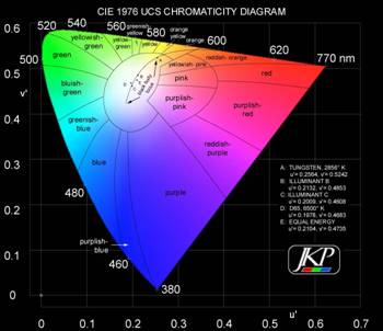
Colors are measured in chromaticity coordinates. Most discussions generally show the 1931 CIE Diagram with x,y coordinates, but the relative distribution of colors is not perceptually uniform for the eye. In particular, it stretches and over emphasizes the eye’s resolution of greens and compresses the reds and blues. In 1976 a Uniform Chromaticity Scale (UCS) with u',v' coordinates was developed in order to provide a perceptually uniform color space. It provides a much more accurate rendering of the eye’s sensitivity to different colors. Equal distances anywhere on the UCS diagram correspond to equally perceived color differences. Figure 3 shows the distribution of colors in this space (figure courtesy of Joe Kane Productions). Note that this figure is only schematic because displays, projectors, film and print media are unable to produce the most saturated colors in the outermost regions of the UCS “horseshoe,” so they wind up being rendered the same as colors in the inner parts of the diagram.
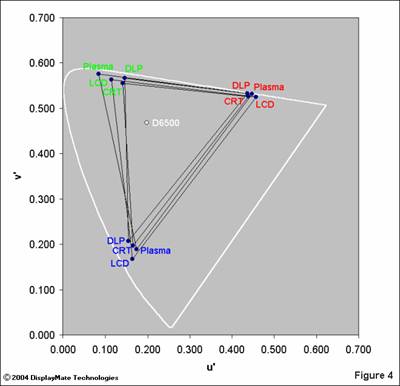
We measured the chromaticity coordinates for the red, green and blue primaries on each display with the Konica Minolta CS-1000 Spectroradiometer and a set of DisplayMate for Windows test patterns. These are shown in a UCS diagram in Figure 4 below, but without including the interior colors for clarity. The outer white line defines the pure spectral colors (upper horseshoe) and the purples connecting the extreme ends of the visible spectrum (lower diagonal line). The CRTs and Plasmas generate their primary colors using light emitting phosphors, while the LCDs and DLPs use color filters together with a light source. Some Plasmas (including the NEC 61XM2) also have filters in order to fine-tune their primary colors.
Color GamutThe color gamut of each display is the area inside the triangle formed by connecting its primary colors. The bigger the triangle the wider the color gamut. Note that directions parallel to the outer white line are differences in hue and directions perpendicular to it are differences in color saturation. The high saturation colors that lie outside of a triangle cannot be reproduced by the display. Instead it generates the closest color that it is capable of producing. This actually isn’t as serious a problem as you might expect because highly saturated colors are seldom found in nature, so a display seldom needs to generate such colors.
From Figure 4 we see that the Plasma has the widest color gamut and the DLP the smallest, although of all of the flat panels it has primaries closest to the CRT, which is our reference standard. All of the primaries have a relatively high color saturation because they are close to the outer white border. The major difference between the displays is in the hues of the primaries (rather than their saturation) and the biggest variation is in the greens.
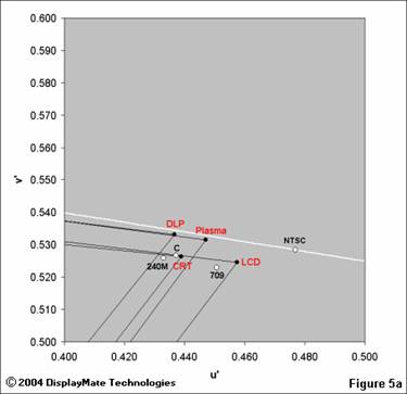
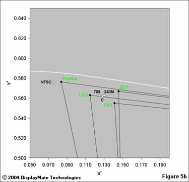
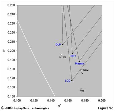
Primary Color Standards In imaging applications the accuracy of color reproduction is generally what matters the most. That’s why standards for the primary colors are very important. Not surprisingly, many different standards have evolved over the years. They include the original NTSC colors defined in 1953 (now considered obsolete), SMPTE C, SMPTE 240M and ITU-R BT.709 standards. In order to show both the displays and standards together we’ve made separate enlarged Figures 5abc for each primary color. Note that in these figures SMPTE C is shown simply as “C.” Television, DVD, Web and computer based photographic content are generally color balanced on professional CRT studio monitors that have phosphors relatively close to SMPTE C, such as the Sony monitor in this article (Ikegami studio monitors also have SMPTE C phosphors), so you’ll get the most accurate images if your display has these values also. ITU-R BT.709 is actually the official standard for High Definition television, but SMPTE C will continue to reign as the true operational standard until a new generation of monitors with “709” phosphors are introduced and the current generation of studio monitors are replaced. Again, directions parallel to the outer white line are differences in hue and directions perpendicular to it are differences in color saturation.
It was relatively easy to visually identify the differences between the various primaries using test patterns, photographs and DVDs. They were consistent with the spectroradiometer measurements. The differences are most apparent in images that include highly saturated colors. For red, the DLP and LCD are separated the most. For green the Plasma produced a green that was significantly different than all of the other displays, and is actually quite close to NTSC green. This will have a tendency to add a green caste that can be partially corrected using the display’s color controls (see below). For blue the DLP and LCD are again separated the most. In each case the CRT primaries were in the middle of the pack, which is not surprising given that it is the reference standard so none of the displays can stray too far from it. Overall, the DLP had primaries closest to the CRT, with the Plasma coming in second. (It would have been a tie had the Plasma green not been so far off.) Transforming Primaries The different sets of primaries produce different color renderings of any image. This results in hue and saturation errors if your display has primaries which are different from the standard that was used to color balance the source material. While it’s possible for any display to electronically transform its primaries into closer agreement with any of the standards, only the professional Sony CRT monitor provided this capability; none of the flat panel displays did so. The electrically transformed primaries are created by adding small percentages of the signal for each primary color to the signals of the other two primary colors. This creates new effective primaries that have altered positions on the chromaticity diagram. Note that transforming primaries can only reduce the display’s native color gamut to a standard gamut, but cannot increase it. If there are regions of the primary color triangle for the standard primaries that lie outside of the color triangle for the native primaries of the display, then colors in those regions will still not be reproduced accurately. Because SMPTE C will eventually be superceded by ITU-R BT.709, displays should be able to switch between either standard, depending on the source material being viewed. In the absence of this capability, the Tint and Saturation controls can be used to get the most critical colors correct, generally the flesh tones, but that will again introduce additional color errors throughout the image.
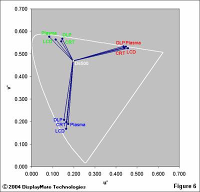
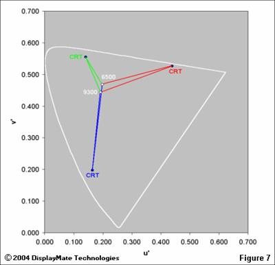
Primary and White-Point Variations Another way to illustrate the variations in primaries is shown in Figure 6, which connects the D6500 white-point to all of the primaries. These vectors show the different color tracks for each of the primaries as the saturation goes from zero at the D6500 white-point to a fully saturated primary color. The reds are tightly clustered because they play a critical role in reproducing pink flesh tones. Larger variations, like those for the greens, would require large adjustments for the Tint Control in order to correct the resulting variation in flesh tones, and that would throw off all of the other colors significantly. Figure 7 shows how a change in the white-point from D6500 to 9300 K affects the primary color tracks for the CRT. (The other display technologies are not shown for clarity.) The blue tracks closely overlap, indicating that the change is equivalent to a shift in blue saturation. The biggest difference is in the red tracks, where there are both hue and saturation shifts. Note that the location of the white-point has the greatest effect on low saturation colors and the least for high saturation colors. One way to produce better flesh tones from a 9300 K white-point is to enhance the red signal so that it shadows the 6500 K track more closely. This is the origin of “red push,” which is generally found in video displays set up for 9300 K at the factory.
|