The Intensity Scale (sometimes called the Gray Scale) not only controls the contrast within all displayed images but it also controls how the Red, Green and Blue primary colors mix to produce all of the on-screen colors. The steeper the Intensity Scale the greater the image contrast and the higher the saturation of displayed color mixtures. So if the Intensity Scale doesn't follow the Standard that is used in all consumer content then the colors and intensities will be wrong everywhere in all images.
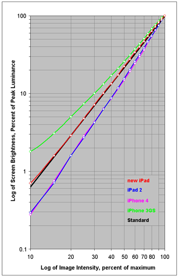
In order to deliver accurate color and image contrast a display must closely match the Standard Intensity Scale. Figure 3 shows the measured Intensity Scales for the displays alongside the industry standard Gamma of 2.2, which is the straight black line.
The iPhone 3GS has a horrible shallow curved Intensity Scale that washes its already low Contrast and poor Color Saturation from its small Color Gamut. The best compromise solution that we recommended in our Shoot-Out article was to make the Intensity Scale straight and slightly steeper than the Standard in order to boost Image Contrast and Color Saturation. That's what happened next with the iPhone 4 and iPad 2.
The iPad 2 and iPhone 4 both have a steep but relatively straight and smooth Intensity Scale that partially compensates for the weak Color Gamut and color saturation. The new iPad has an accurate Standard Color Gamut so it no longer needs the benefits of a steep Intensity Scale. In order to get accurate Image Contrast and Colors it now needs to follow the Standard Intensity Scale, which it does very nicely.