The Intensity Scale (sometimes called the Gray Scale) not only controls the contrast within all displayed images but it also controls how the Red, Green and Blue primary colors mix to produce all of the on-screen colors. The steeper the Intensity Scale the greater the image contrast and the higher the saturation of displayed color mixtures. So if the Intensity Scale doesn't follow the Standard that is used in all consumer content then the colors and intensities will be wrong everywhere in all images.
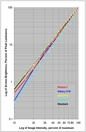
In order to deliver accurate color and image contrast a display must closely match the Standard Intensity Scale. Figure 3 shows the measured Intensity Scales for the displays alongside the industry standard Gamma of 2.2, which is the straight black line.
The iPhone 4 has a steep but relatively straight and smooth Intensity Scale that partially compensates for its weak Color Gamut and color saturation.
The new iPad has a virtually perfect and accurate Intensity Scale that matches the Standard and it also complements its very accurate Color Gamut.
The iPhone 5 and Galaxy S III both have slightly steep Intensity Scales that introduce more image contrast and color saturation into their images over and above the Standard Intensity Scale. While the iPhone 5 Intensity Scale is very smooth and straight, the Galaxy S III steepens significantly at the dim-end.