The Intensity Scale (sometimes called the Gray Scale) not only controls the contrast within all displayed images but it also controls how the Red, Green and Blue primary colors mix to produce all of the on-screen colors. The steeper the Intensity Scale the greater the image contrast and the higher the saturation of displayed color mixtures. So if the Intensity Scale doesn't follow the Standard that is used in all consumer content then the colors and intensities will be wrong everywhere.
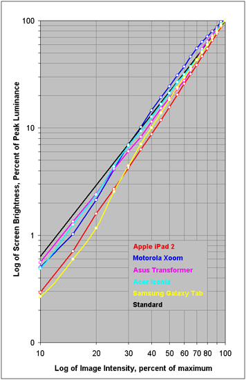
In order to deliver accurate color and image contrast a display must closely match the Standard Intensity Scale. Figure 3 shows the measured Intensity Scales for the Tablets alongside the industry standard Gamma of 2.2, which is the straight black line.
The iPad 2 has a steep but relatively straight and smooth Intensity Scale that partially compensates for the weak Color Gamut and color saturation. This is the preferred behavior for producing strong image contrast and increasing color saturation. The Galaxy Tab has a similar approach but starts off close to the Standard Intensity Scale and then progressively steepens for increasing image contrast and color saturation. The Asus Transformer has a somewhat irregular Intensity Scale that none-the-less remains relatively close to the Standard. The Acer Iconia has an Intensity Scale that hugs the Standard down to 30 percent Image Intensity and then it steepens. The Motorola Xoom has a very irregular Intensity Scale that is very flat at the bright-end, which significantly reduces color saturation, and then takes a dive at the dim-end.